
SpongeBob Just Rode The Tour. Good. Pro Bikes Needed A Slap In The Face.
Factor's SpongeBob and Patrick Star Tour de France Femmes bikes look ridiculous. That is exactly why they matter.
Somewhere between the wind tunnel and the boardroom, pro cycling forgot that bikes are meant to make people grin. Then Factor turned up at the Tour de France Femmes with SpongeBob SquarePants and Patrick Star on two top-level aero bikes, and half the internet immediately behaved as if someone had put streamers on a nuclear submarine.
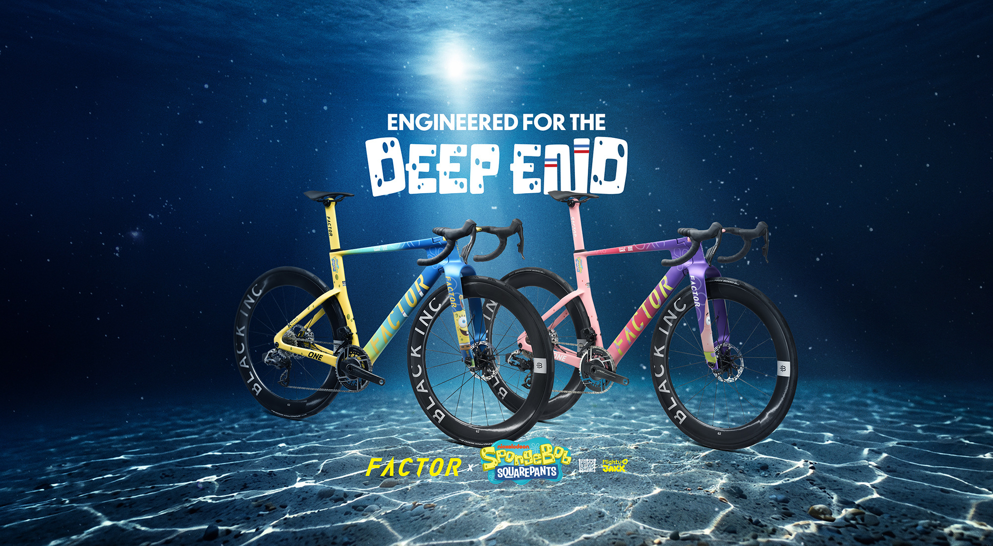
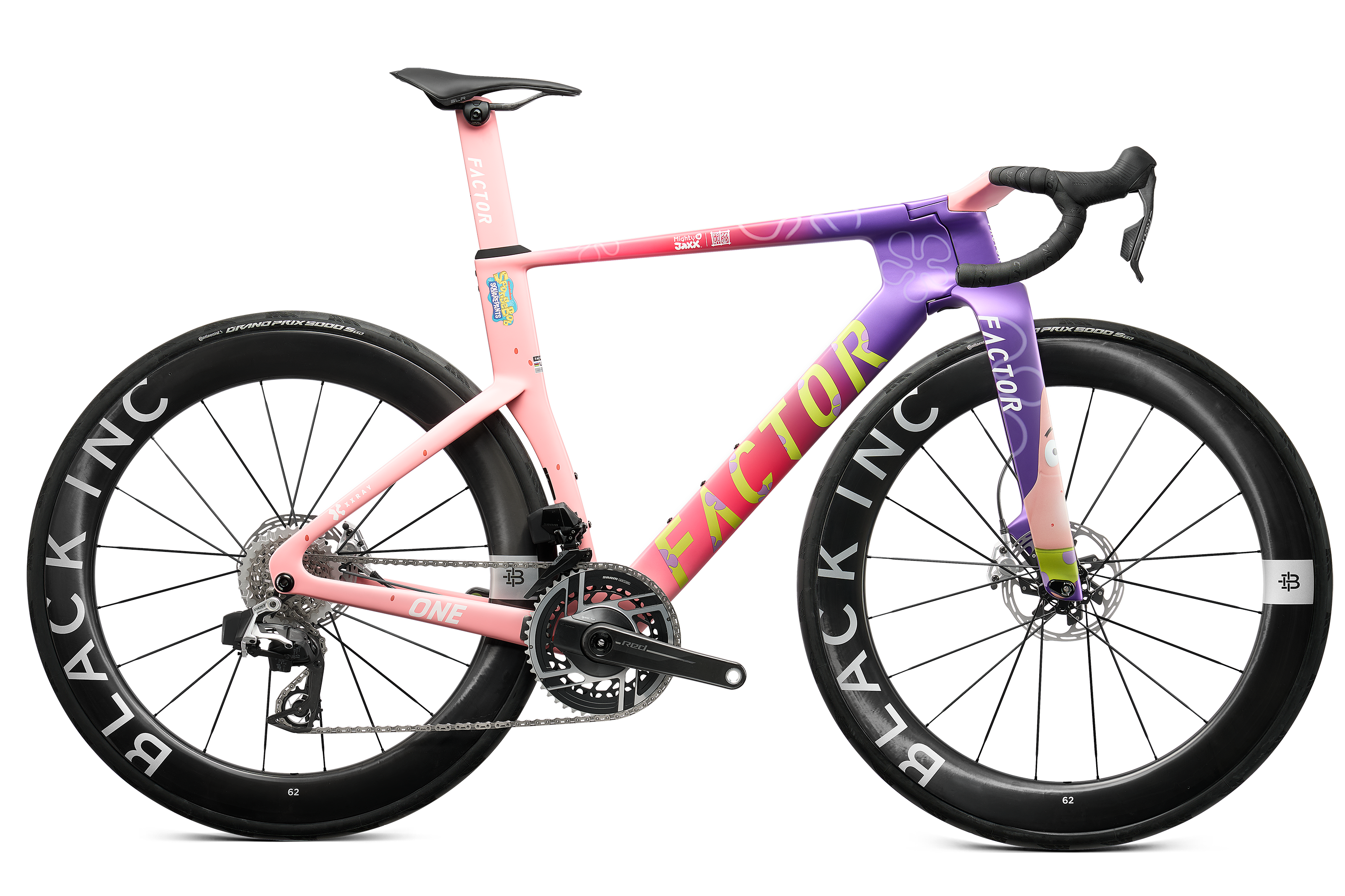
Good. Let them clutch their black bidons. Human Powered Health are racing the yellow and blue Factor One XXRAY Plus SpongeBob SquarePants Edition. Ma Petite Entreprise have the pink and purple Patrick Star version. These are not charity ride specials or influencer props parked outside a coffee van. They are proper race bikes, built around Factor's One aero platform, dressed for the Tour de France Femmes and fitted with SRAM Red AXS and Black Inc 62 wheels. In other words, the joke is not that they are unserious bikes. The joke is that almost every other pro bike looks like it was approved by a committee of accountants recovering from a crash in a Pantone factory.
The peloton needed Bikini Bottom more than another stealth bomber
Look around the modern bunch. Matte black, dark navy, deep red, maybe a tasteful fade if the brand manager had an espresso after lunch. We have somehow arrived at an era where a $20,000 race bike can look less interesting than a rental e-scooter. Every tube is sculpted, every bar is integrated, every cable has vanished, and yet the finished product often has the personality of a tax invoice.
That is why the Factor stunt lands. Not because SpongeBob is inherently cool, although plenty of millennial cyclists will now pretend they did not watch him before school. It lands because the visual language of elite cycling has become terrified of seeming childish, even while selling grown adults ceramic jockey wheels, aero socks and subscription training plans with a straight face.
A race bike can be technically serious without looking like it has been sentenced to life in a wind tunnel.
That is the real point here. Factor's chief brand officer David Millar framed the project as a meeting of performance and playfulness. Marketing line? Absolutely. But also correct. The One is a savage-looking aero platform with enough fork and tube real estate to carry actual artwork, not just another tasteful badge near the bottom bracket that only the team mechanic and a sponsor's nephew will ever notice.
Yes, it is marketing. So is your 'heritage' head badge.
The predictable response is that this is all a gimmick. Of course it is. Professional cycling is made of gimmicks. Limited-edition Tour paint is a gimmick. One-off yellow bikes for GC winners are gimmicks. Team switch-out kits are gimmicks. Colnago, Trek, Specialized, Canyon and Pinarello do not spend money on special finishes because paint makes the bike faster. They do it because memory is a currency, and cycling is lousy at earning it outside July.
The difference is that Factor has at least admitted the game. It has put the cartoon on the fork and let the bike shout. No fake restraint. No 'inspired by the gradients of Provence' nonsense. No launch copy pretending a charcoal fade represents the courage of the domestique. Just SpongeBob, Patrick, big wheels, deep forks and a Tour de France Femmes peloton already producing better racing than most of the men's processions we are told to worship.
What the SpongeBob bike gets right
- It is instantly recognisable at race speed, which is more than you can say for most WorldTour equipment.
- It gives Human Powered Health and Ma Petite Entreprise visual oxygen in a race where sponsor exposure actually matters.
- It treats women's cycling as a place for major cultural launches, not as a smaller billboard after the men's Tour has packed up.
- It reminds bike brands that colour is not a crime.
- It will make kids point at the television. That matters more than another forum thread about seatpost compliance.
That third point is the important one. The Tour de France Femmes is not a back alley product demo. It is happening right now, from 1 to 9 August, with Marlen Reusser in yellow after smashing the Dijon time trial, Demi Vollering already throwing punches in the hills, and the race still heading toward the nastier terrain. SBS is giving Australians the whole thing live and free, which means a lot of us are watching at profoundly stupid hours with one eye on the kettle and the other on a race that refuses to behave politely.
Into that, Factor has dropped two bikes that normal people can actually remember. Not normal in the sense of cheap, obviously. These are still elite race machines in the familiar modern fantasy price zone. But normal in the sense that they create a human reaction beyond 'nice integration'. If your brand's superbike can only be appreciated by someone who knows the UCI's fork depth rules, you have failed at the most basic level of desire.
Australian shops should be taking notes
Walk into plenty of Australian bike shops and you will see the same disease. Rows of carbon road bikes in shades of fog, bruise and shareholder grey. Gravel bikes trying desperately to look like they own a cabin in Bright. E-MTBs with the graphic ambition of a battery warning sticker. Then everyone wonders why new riders think the sport is expensive, joyless and weirdly hostile.
Colour is not just decoration. It is invitation. BMX understood this. Mountain biking understood it before the enduro bros discovered beige. Even commuter bikes, when brands bother, know that a good colour can sell a feeling before a spec sheet sells a feature. Road cycling, for all its supposed romance, has spent the last decade dressing like a private equity pitch deck.
The SpongeBob Factor will annoy the right people. It will annoy the man who weighs his bar tape. It will annoy the bloke who calls every non-black bike 'a bit much' while wearing mirrored glasses and white shoes to a cafe ride. It will annoy the comment-section purist who thinks fun is fine as long as it happened in 1998 on a steel frame and involved a Belgian covered in mud.
If a cartoon bike makes the Tour de France Femmes easier to spot, easier to share and harder to ignore, it has already done more for the sport than another invisible aero update.
The serious lesson inside the stupid bike
This is not an argument that every pro team should raid a children's TV catalogue. Please do not give us Paw Patrol time trial helmets or Minions skinsuits. Cycling can always take a joke too far, then charge $499 for it. But Factor has stumbled into something valuable. The best race bikes should feel fast before they move. They should create lust, argument, loyalty and a bit of embarrassment. They should make a kid ask for a bike and a grown rider pretend they are above it while secretly zooming in on the fork.
So yes, the SpongeBob Factor is ridiculous. It is also brave in a way most high-end bike launches are not. It risks taste. It risks mockery. It risks being remembered. In a sport drowning in marginal gains and muted palettes, that might be the most radical equipment choice at the Tour de France Femmes.
Bring on Patrick Star in the breakaway. Bring on more bikes that look like someone made a decision. And if your next superbike still arrives in matte black with a press release about 'timeless speed', do us all a favour and leave it under the sea.